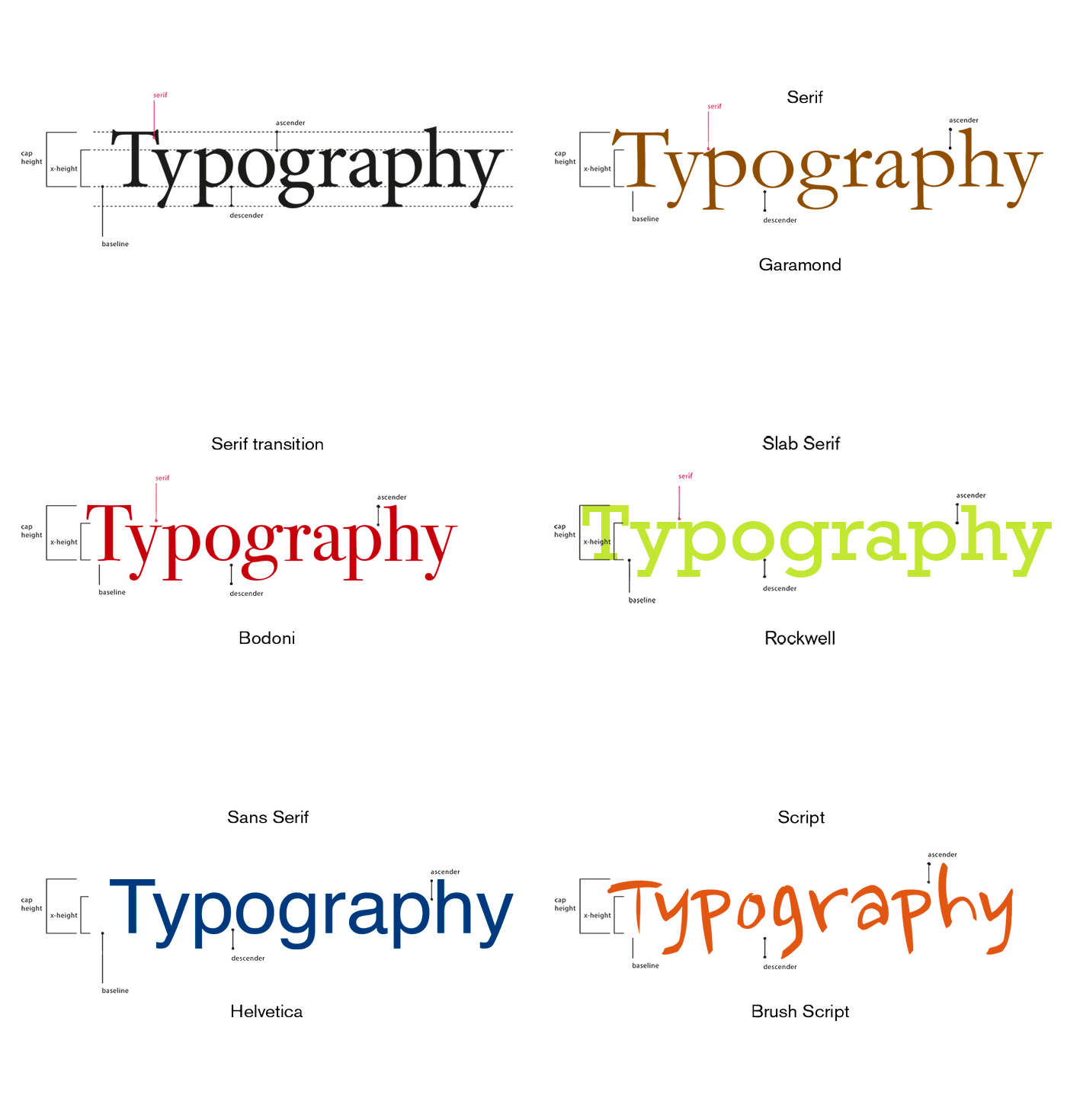

The example above shows basic labeling of type, or letterforms. The letters sit on a baseline. Each letterform has an x-height and a cap-height. Some letterforms have an ascender or a descender. Ascenders are the part of the letterform that rise above the x-height. Descenders fall below the baseline.
Type is measured in picas or points.
1 inch = 6 picas
1 pica = 12 points
1 inch = 72 points
The following typefaces are included in the animated GIF:
Garamond (serif)
Bodoni (serif transition)
Rockwell (slab serif)
Helvetica (sans serif)
Brush Script (script)

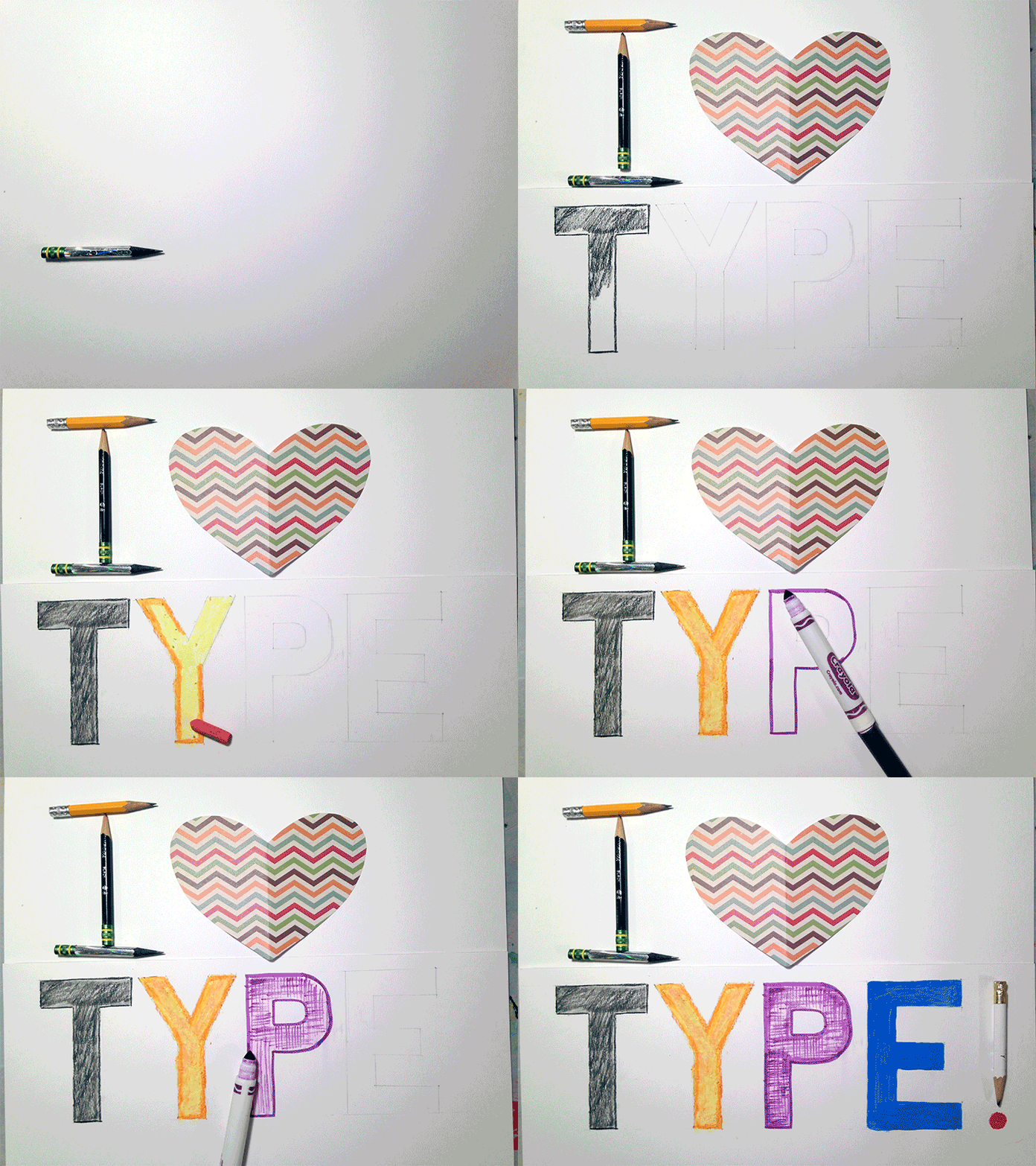
I used approximately 95 still shots taken by my iphone camera to create the animation above. I wanted to showcase different ways of forming type, including constructing letterforms with objects and hand-lettering with various media. The heart is cut out of origami paper. The first letter rendered by hand is drawn with charcoal, the next one pastel, then marker, and last, acrylic/tempera paint.
I adjusted the tone, brightness/contrast, color, and levels in each image in Photoshop in order to eliminate excess shadows and lighting factors. Then, I pasted each individual image as a layer into a new file. See the Animated GIF tutorial for further instructions.
Have fun creating your own animated GIF!
To learn about Adobe Photoshop via hands-on tuturials based on real-world projects, purchase a digital or hard copy book from Against the Clock.
